Composition
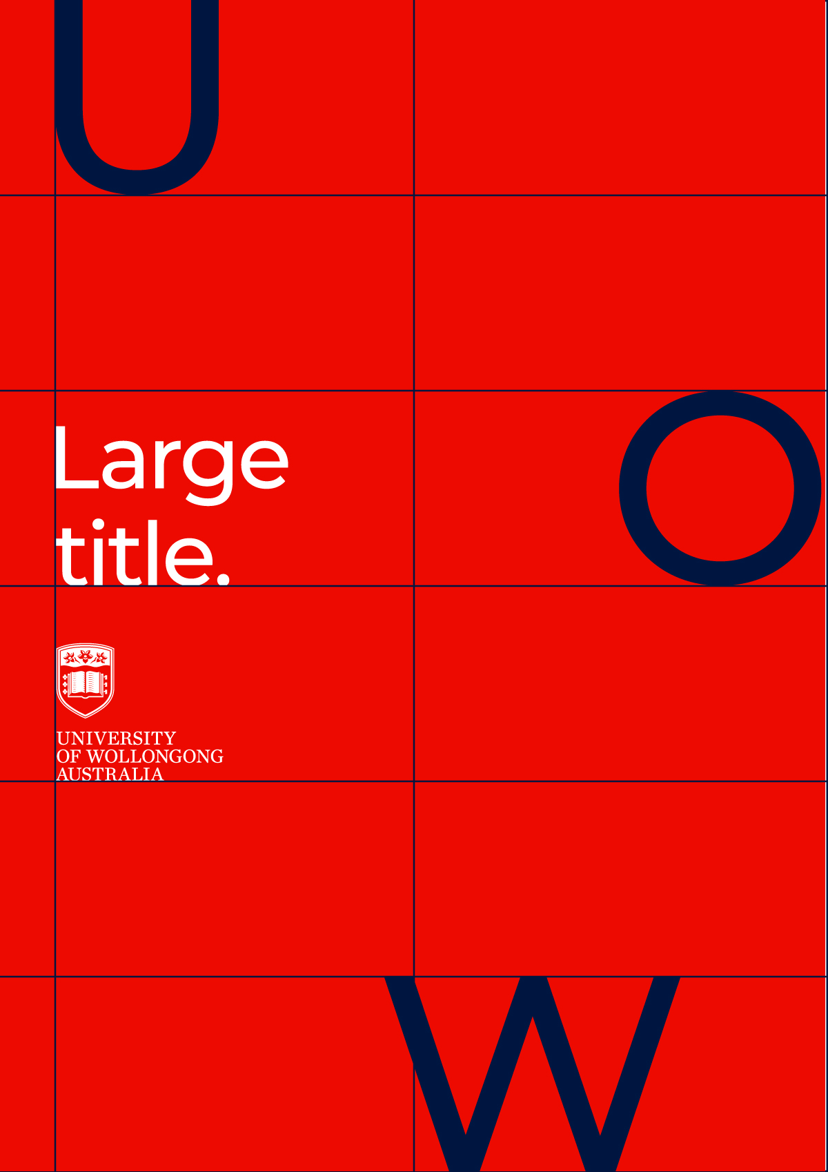
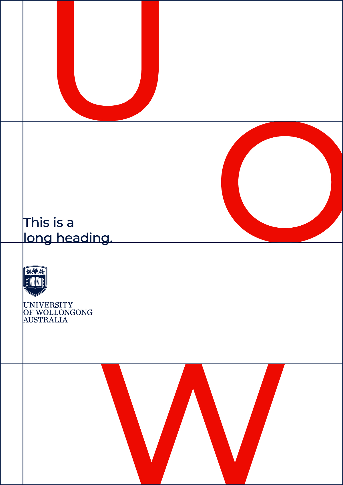
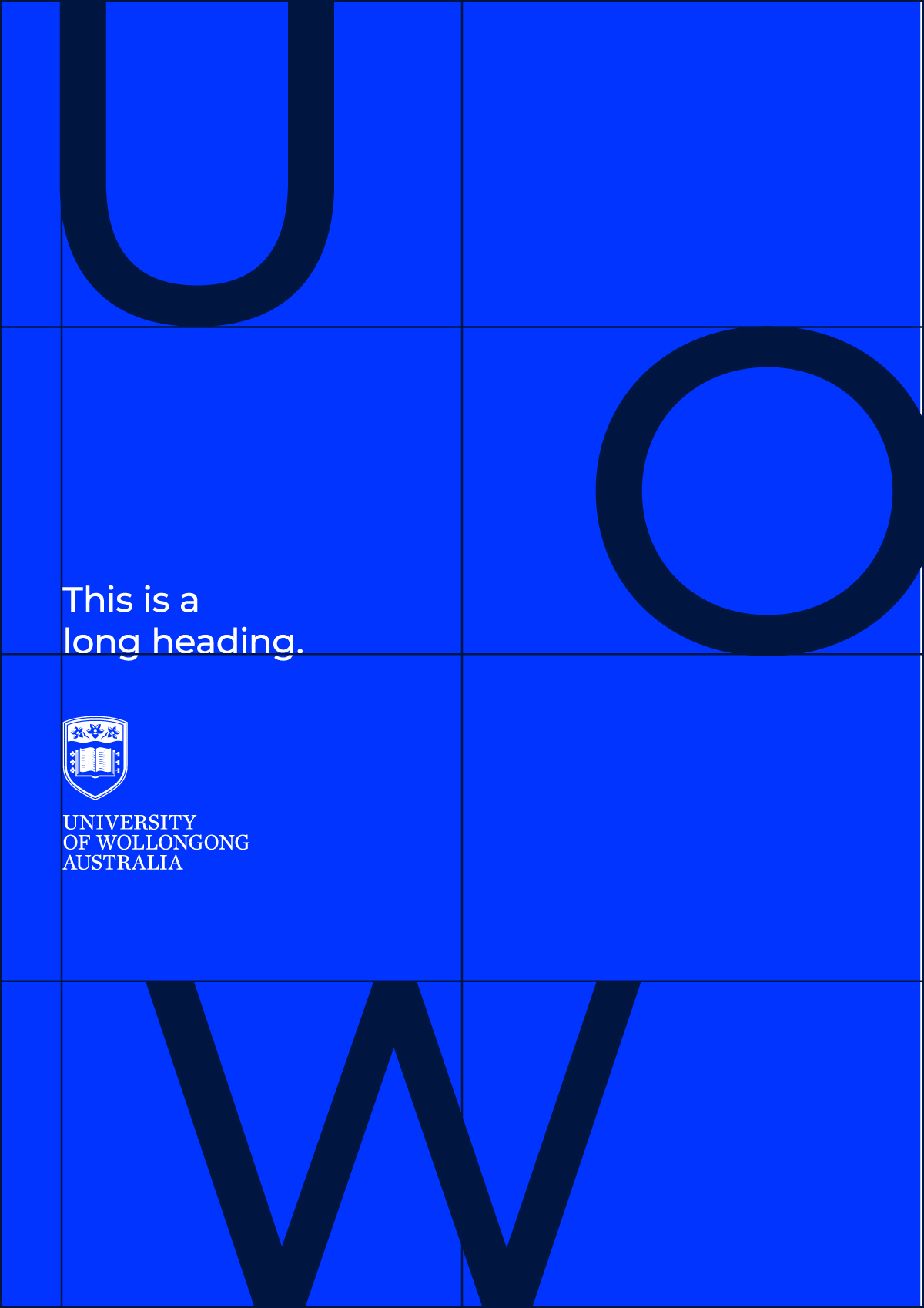
This section demonstrates through a series of simple principles, how the UOW brand system comes together to create a cohesive and flexible system across both print and digital applications. Use these principles as a guide to bring our brand to life. Templates including many examples of UOW composition are available in UOW's designer kit.
Request designer kit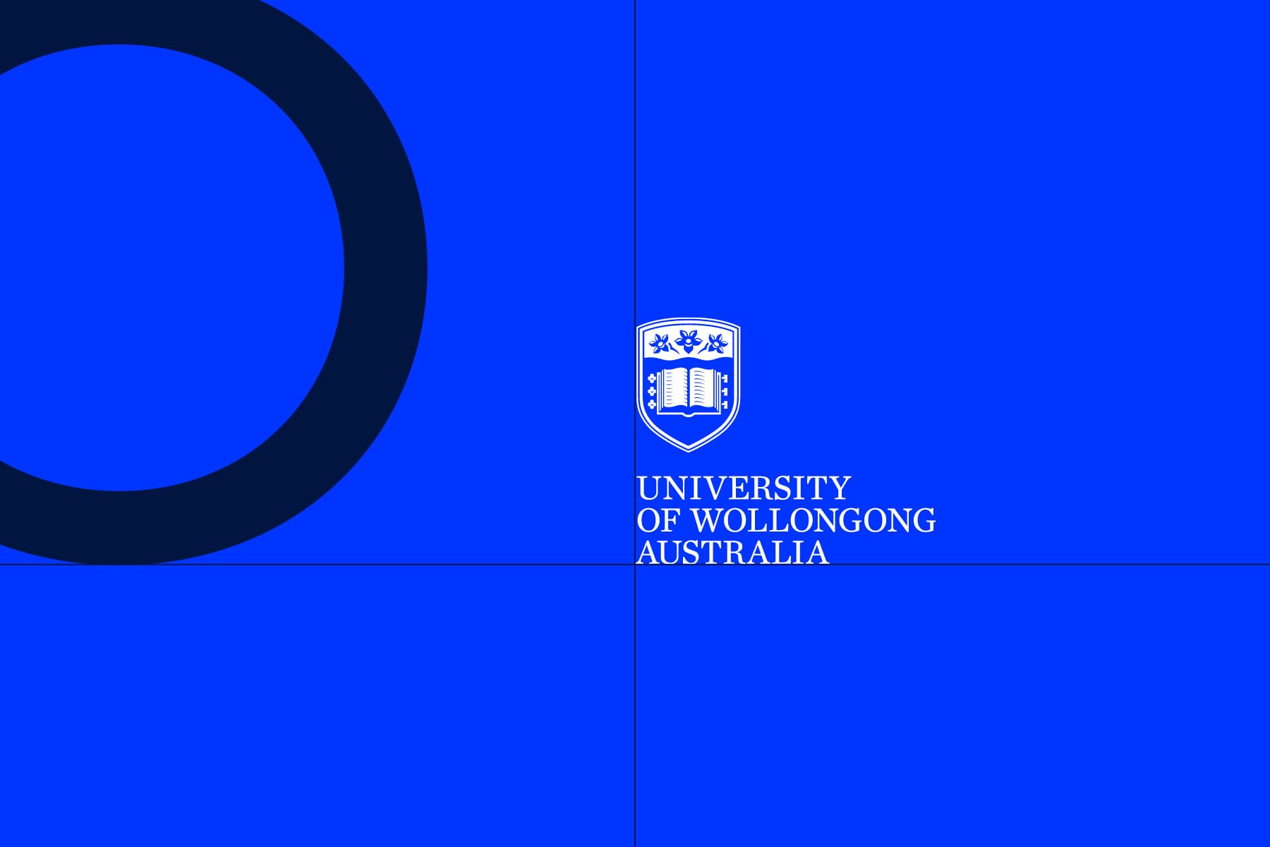
Logo and headlines
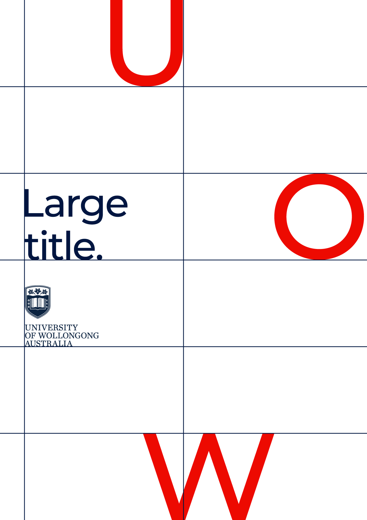
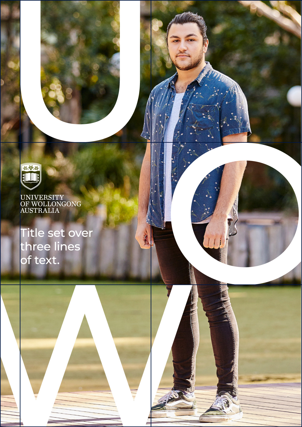
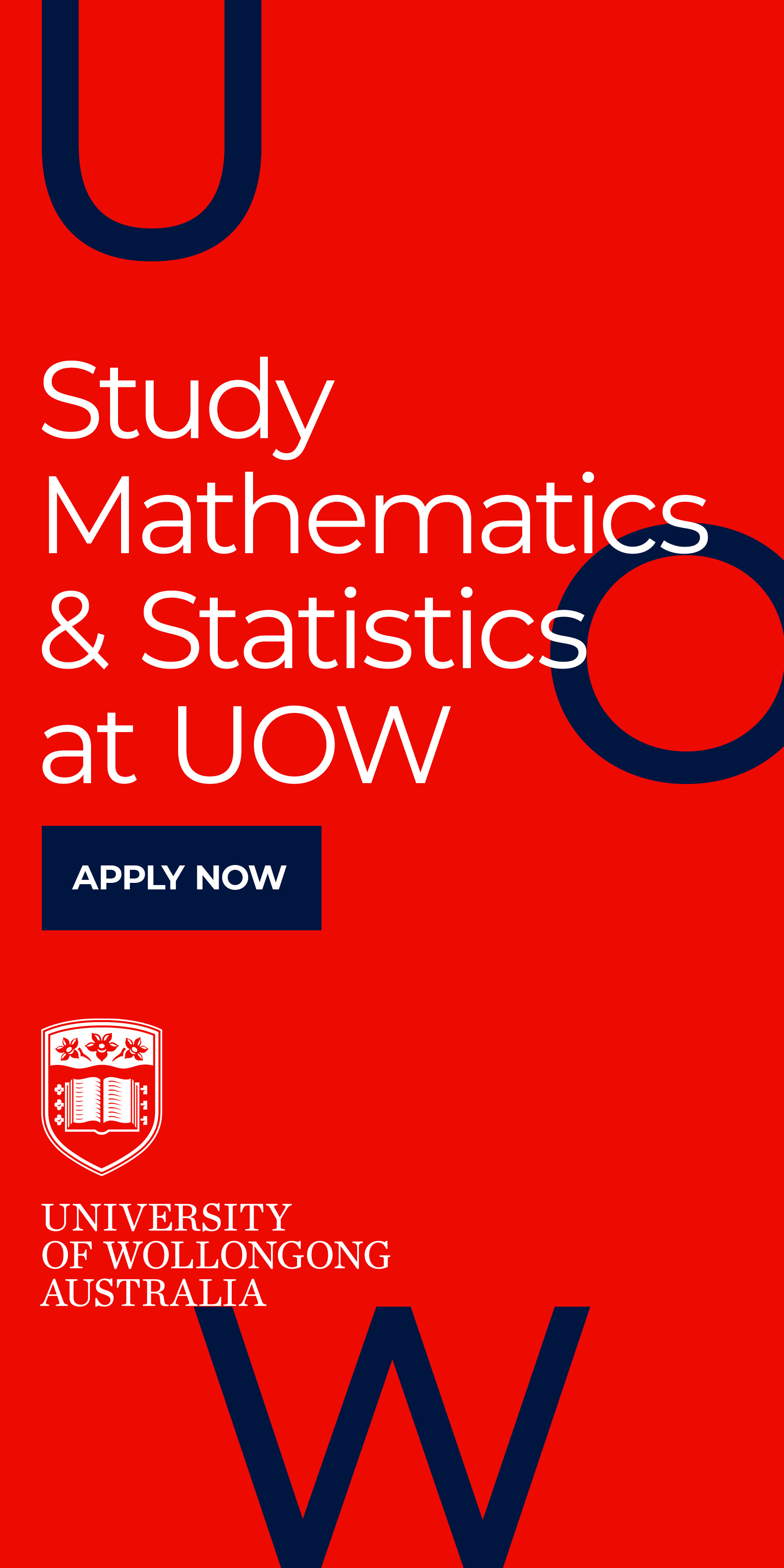
The UOW framework acts to frame content. The row system can be used to help guide the position of elements such as logo and headline. These are interchangeable, depending on where the UOW framework sits. As a guide, logo and headline can sit either ranged left or centred.
12 column grid
Introducing a 12 column grid helps to create a flexible system across both portrait and landscape applications. It can be divided a number of ways depending on content.
Introducing white space
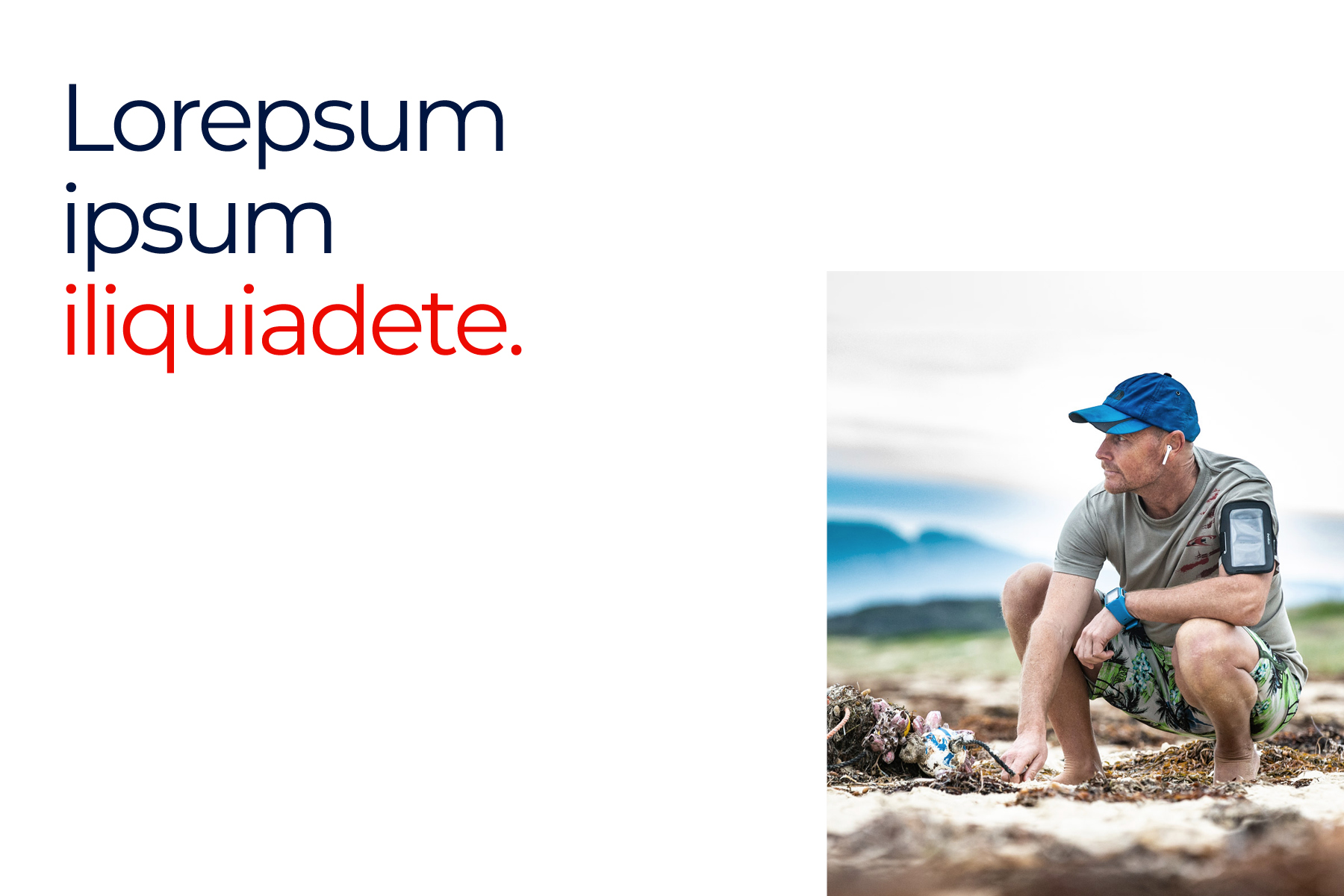
Give elements room to breathe by introducing white space to a suite of applications. Columns can then help determine the size and position of images and graphics.



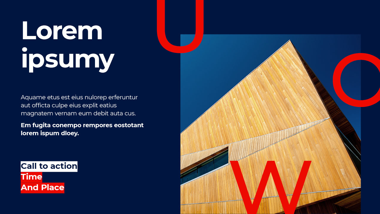
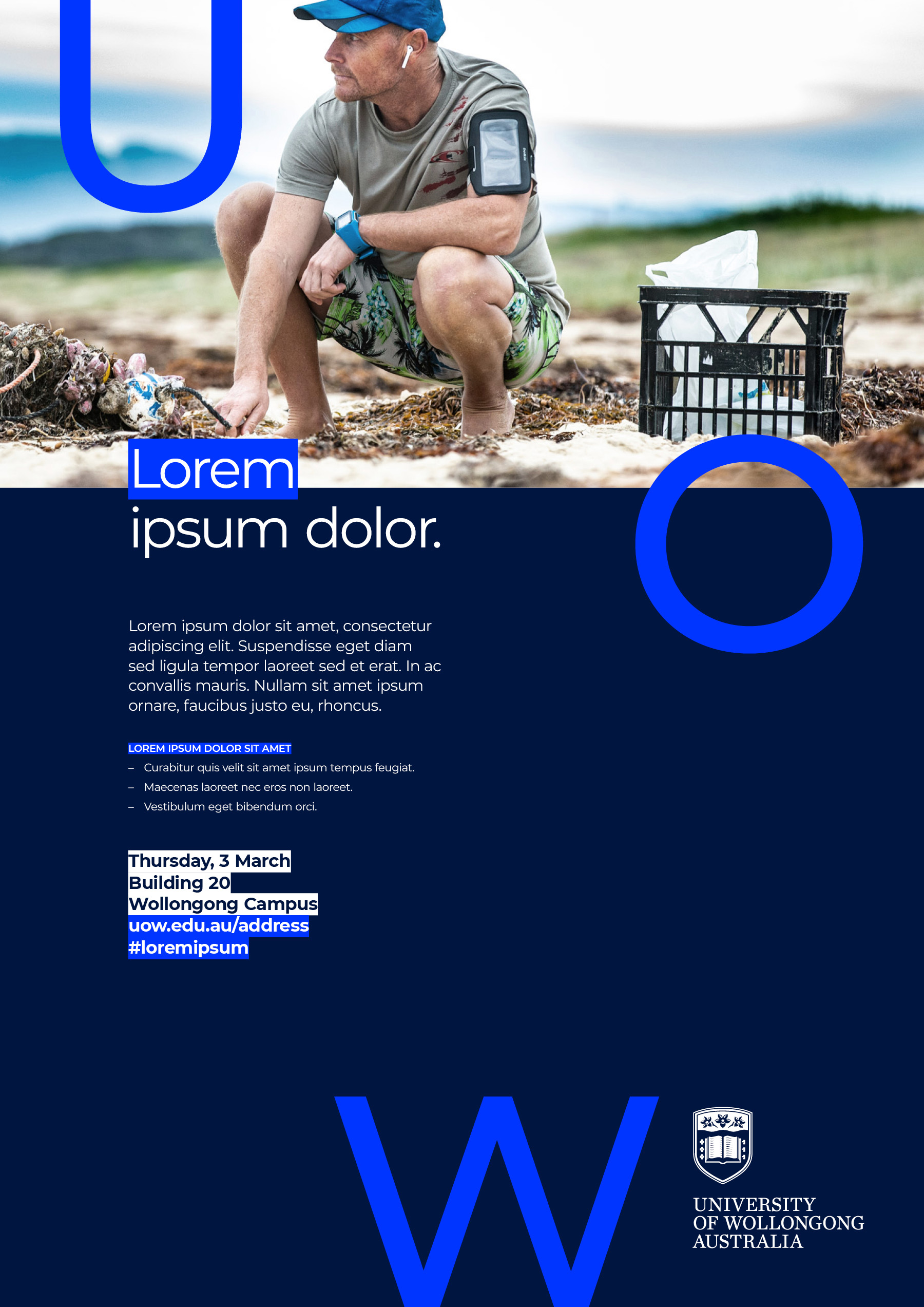
Layering type
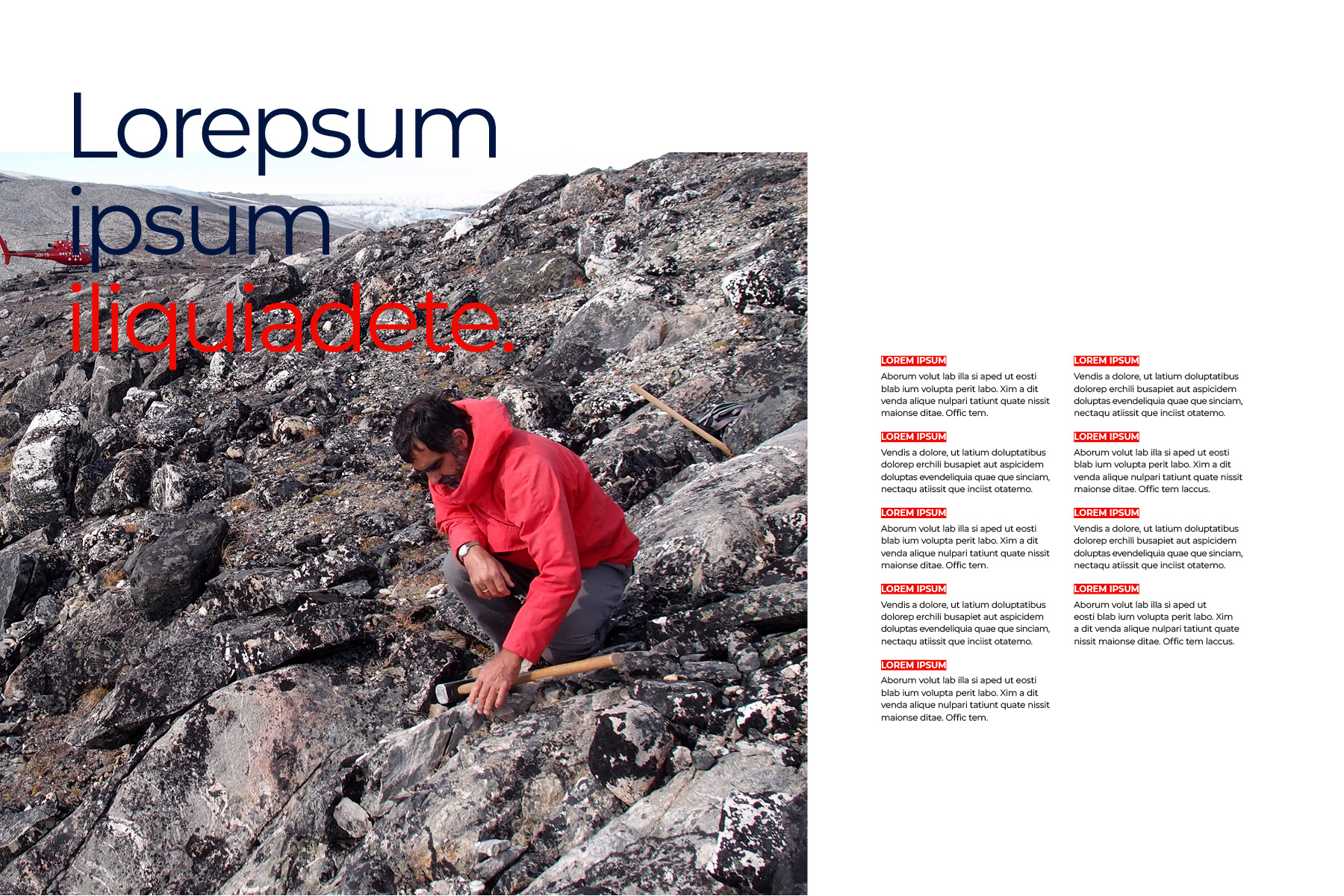
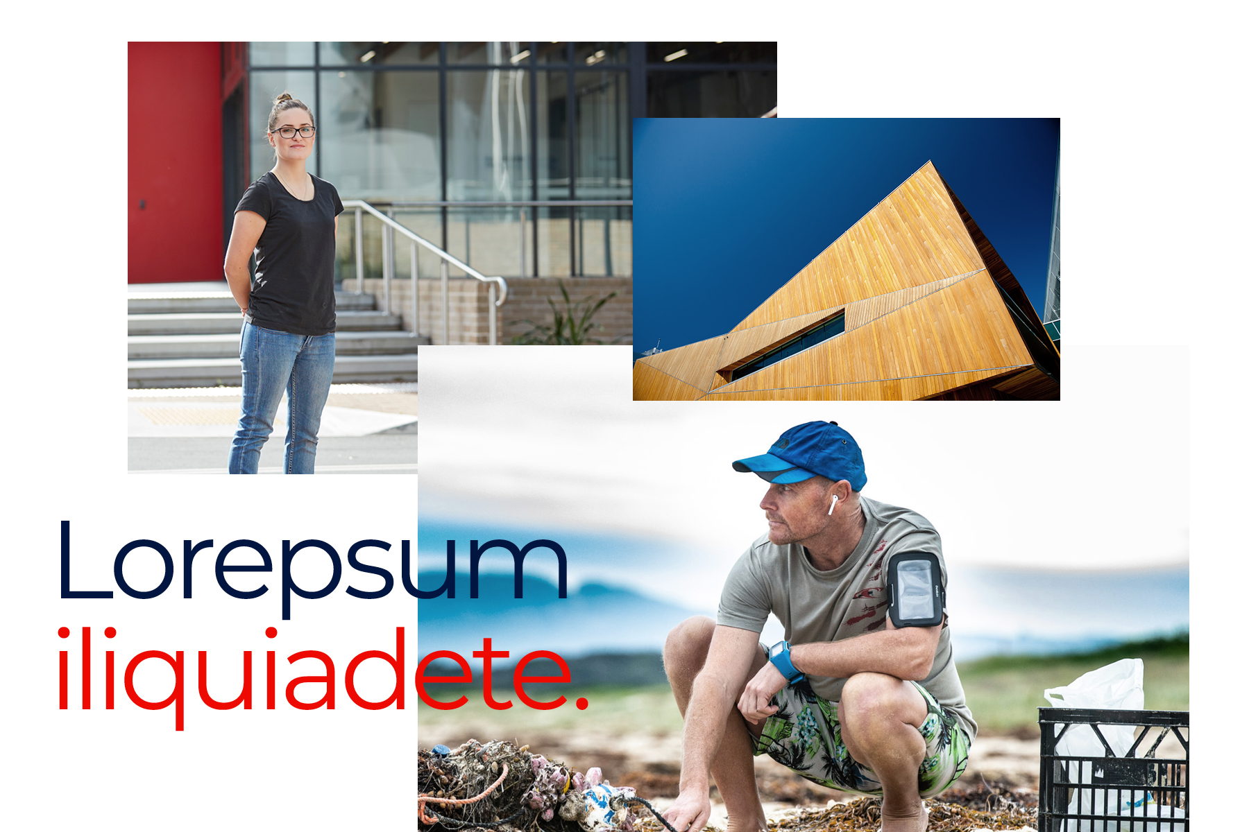
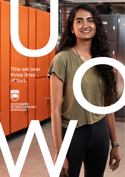
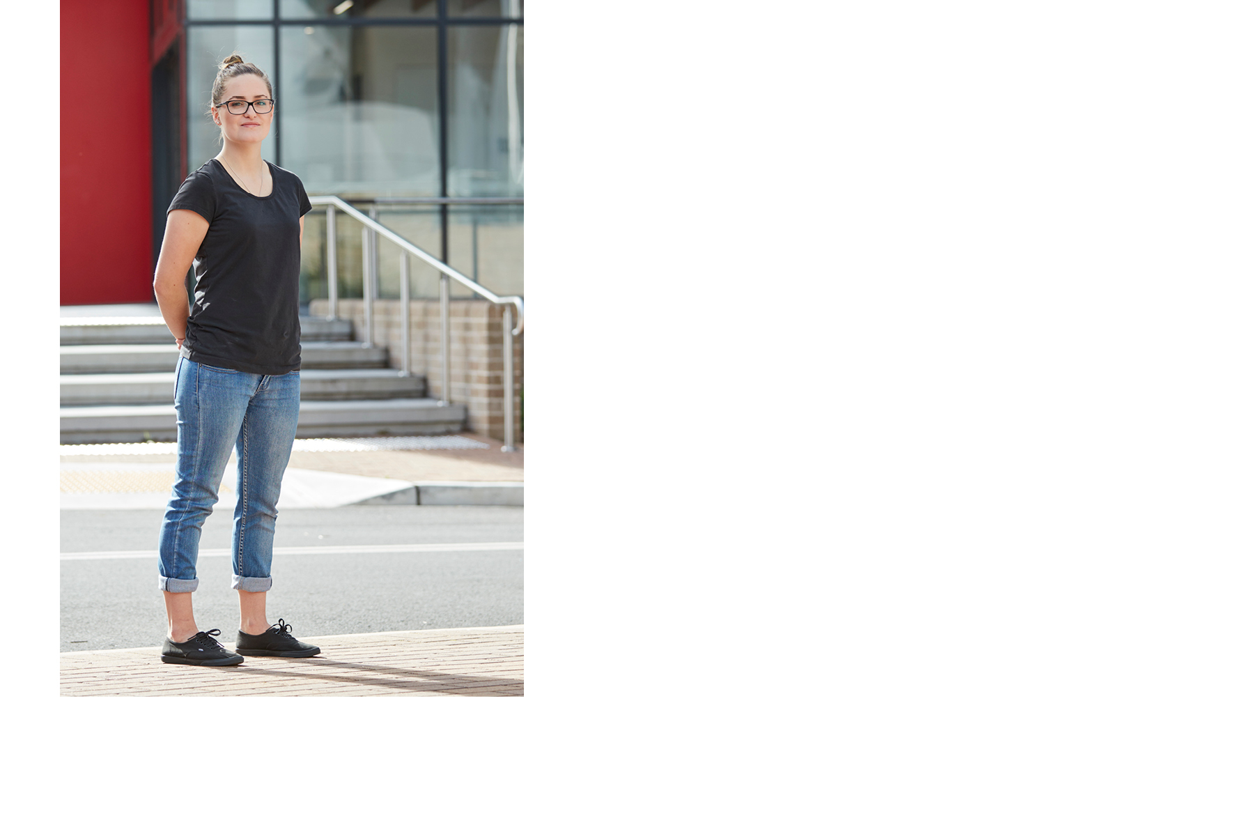
Allowing typography to interact with imagery and graphics can help to create bold and dynamic layouts. Overlapping and layering elements in this way creates a less expected execution.
Framing content
In addition to elements such as logo, the UOW framework can be used to frame content such as typography, imagery and graphic illustration.
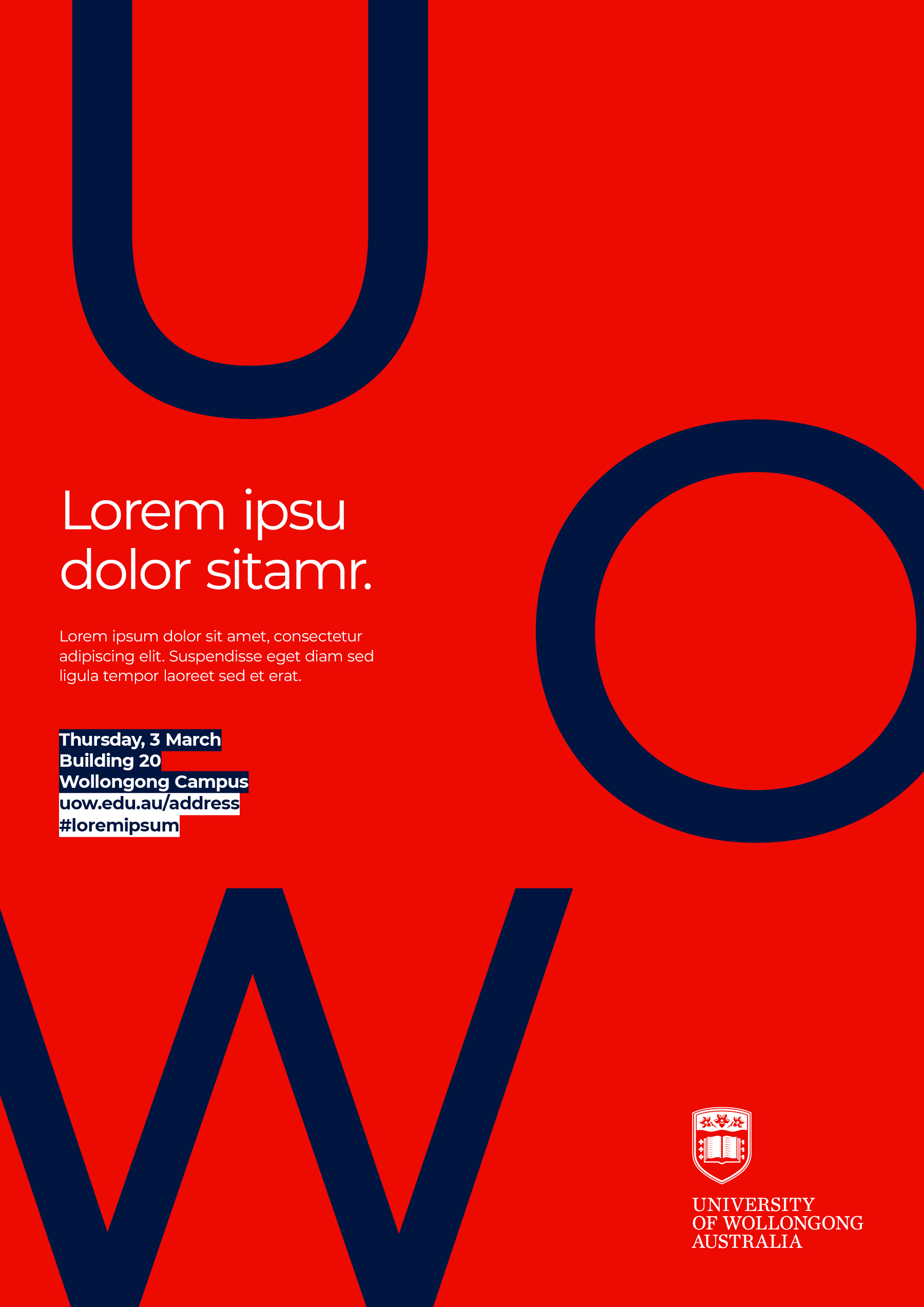
Emphasise with highlights
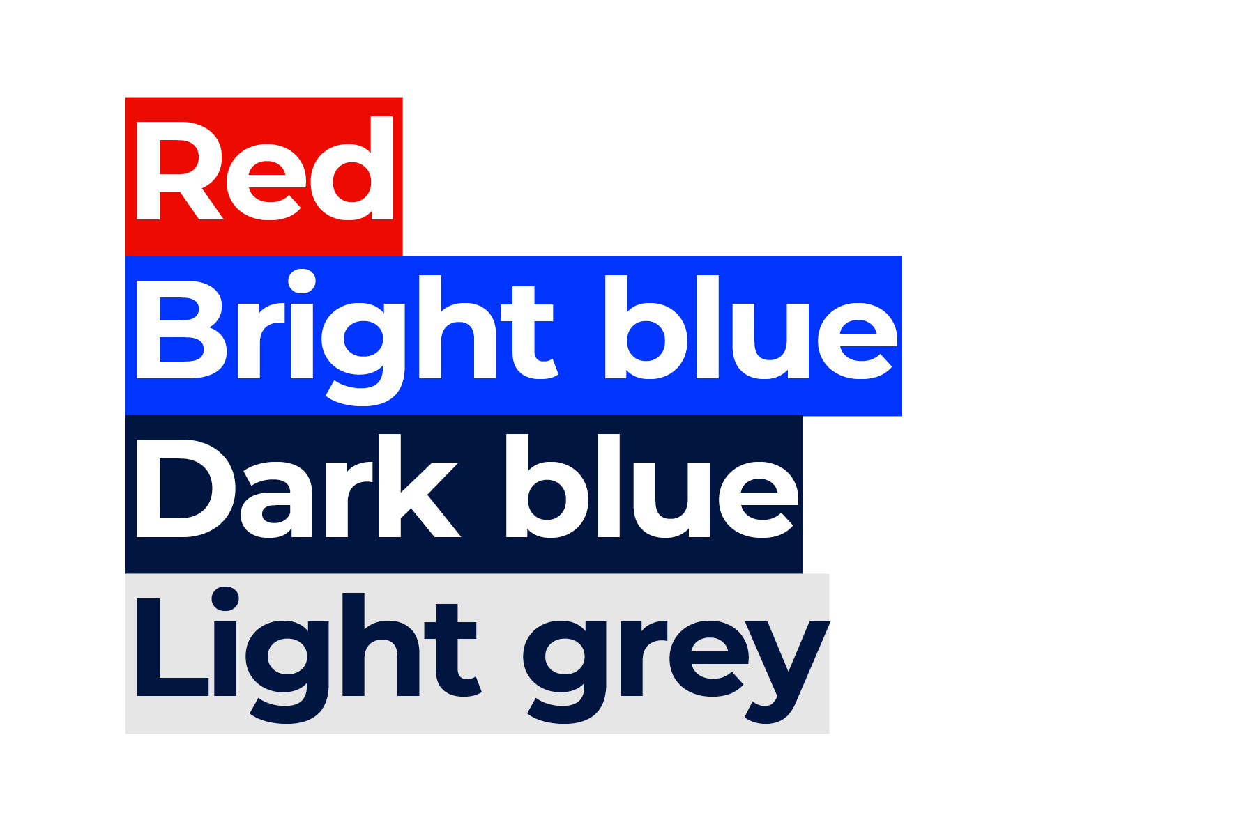
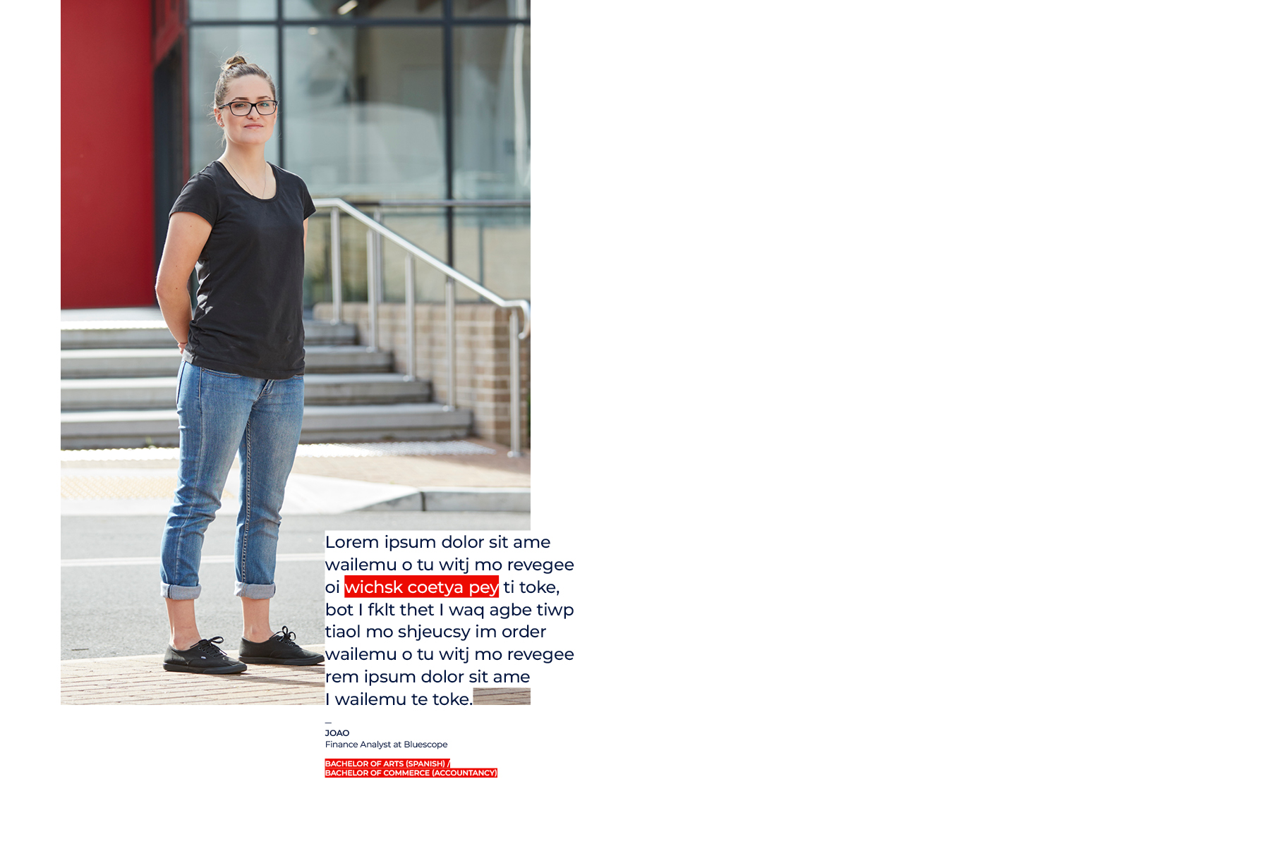
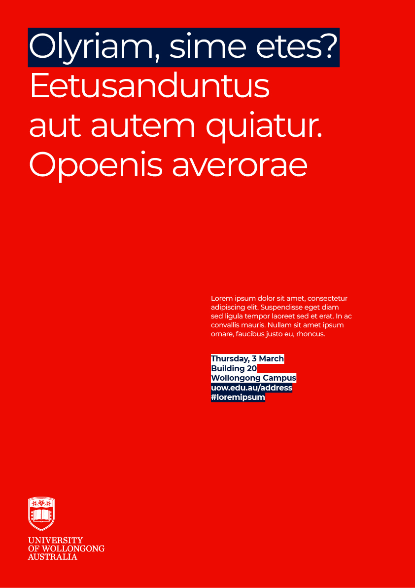
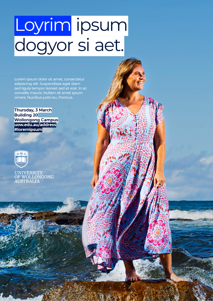
Highlighting keywords within headlines can be used in place of the UOW framework to create distinctive applications with an emphasis on type. When used with imagery, they help to provide clear space and legibility. As a general rule, when writing long headlines, emphasise approximately 20% of the overall headline. Shorter headlines can adopt a three colour combination.
Guidance
Maintaining our composition principles is key to brand consistency. Consider the following points of guidance when creating communications for our brand.
