Key facts – students and staff
2023 figures
- Domestic vs. International Students
- Domestic Students: Commencing v Continuing
- International Students: Commencing v Continuing
- Commencing Student Enrolments by Program Level
- Continuing Student Enrolments by Program Level
- School of Business Students by Countries of Origin
- Commencing Students by Countries of Origin
- Gender Distribution of Academic Staff
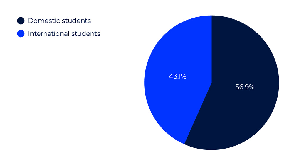
Pie Graph Description: Domestic vs. International Students
The pie graph shows the distribution of Domestic and International Students:
- Domestic Students: make up 56.9% of the total student body. This segment is larger and is shown in navy.
- International Students: account for 43.1% of the total. This segment is smaller and displayed in royal blue.
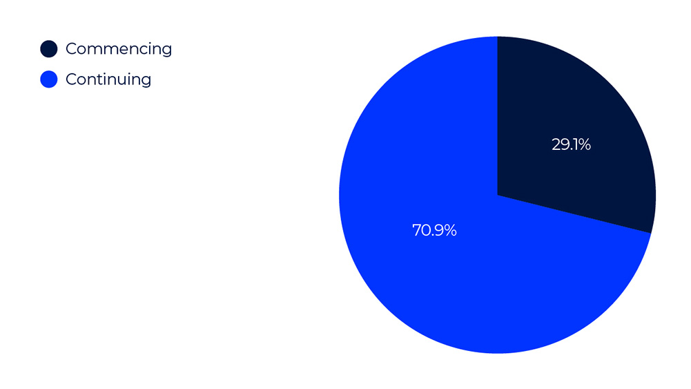
Pie Graph Description: Domestic Students: Commencing v Continuing
The pie graph shows the distribution of Domestic students:
- Domestic Commencing Students: account for 29.1% of the total. This segment is smaller and displayed in navy.
- Domestic Continuing Students: make up 70.9% of the total student body. This segment is larger and is shown in royal blue.
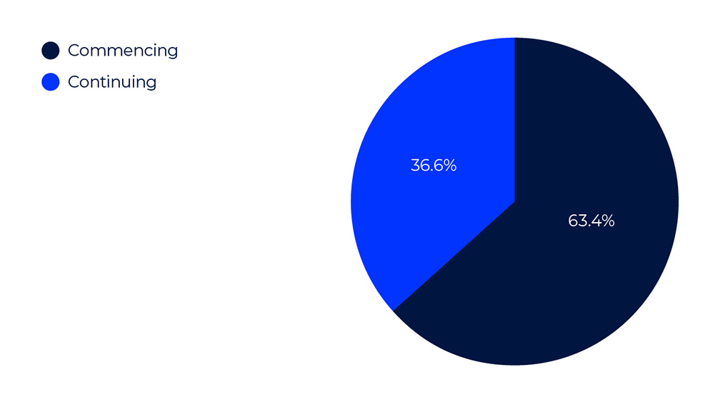
Pie Graph Description: International Students: Commencing v Continuing
The pie graph shows the distribution of International students:
- International Commencing Students: make up 63.4% of the total student body. This segment is larger and is shown in navy.
- International Continuing Students: account for 36.6% of the total. This segment is smaller and displayed in royal blue.
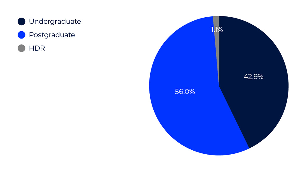
Pie Graph Description: Commencing Student Enrolments by Program Level
The pie graph illustrates the distribution of commencing student enrolments across different program levels:
- Undergraduate Level enrolments represent 42.9% of the total. This segment is the second largest and is depicted in navy blue.
- Postgraduate Level enrolments account for 56.0% of the total. This is the largest segment, shown in royal blue.
- Higher Degree Research (HDR) Level enrolments constitute 1.1% of the total. This smallest segment is represented in grey.
Pie Graph Description: Continuing Student Enrolments by Program Level
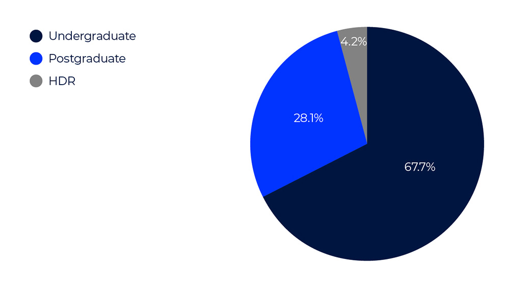
The pie graph illustrates the distribution of continuing student enrolments across different program levels:
- Undergraduate Level enrolments represent 67.7% of the total. This segment is the second largest and is depicted in navy blue.
- Postgraduate Level enrolments account for 28.1% of the total. This is the largest segment, shown in royal blue.
- Higher Degree Research (HDR) Level enrolments constitute 4.2% of the total. This smallest segment is represented in grey.
Pie Graph Description: School of Business Students by Countries of Origin
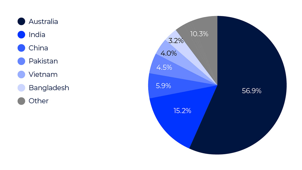
The pie graph shows the distribution of School of Business students by their countries of origin:
- Australia: 56.9% of students, represented in navy blue. This is the largest segment.
- India: 15.2% of students, shown in royal blue.
- China: 5.9% of students, depicted in blue.
- Pakistan: 4.5% of students, illustrated in light blue.
- Vietnam: 4.0% of students, displayed in sky blue.
- Bangladesh: 3.2% of students, represented in light grey.
- Other: 10.3% of students, shown in grey.
Pie Graph Description: Commencing Students by Countries of Origin
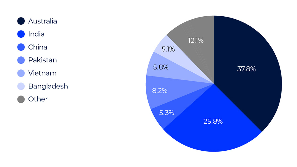
The pie graph shows the distribution of commencing students by their countries of origin:
- Australia: 37.8% of students, represented in navy blue. This is the largest segment.
- India: 25.8% of students, shown in royal blue.
- China: 5.3% of students, depicted in blue.
- Pakistan: 8.2% of students, illustrated in light blue.
- Vietnam: 5.8% of students, displayed in sky blue.
- Bangladesh: 5.1% of students, represented in light grey.
- Other: 12.1% of students, shown in grey.
Pie Graph Description: Gender Distribution of Academic Staff
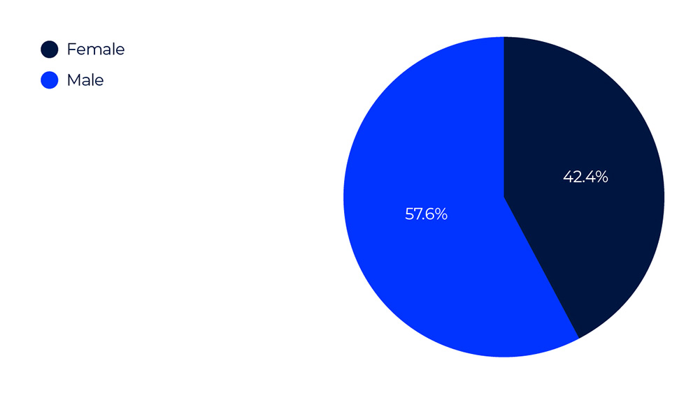
The pie graph shows the distribution of gender distribution of academic staff:
- Females make up 42.4% of the total academic staff. This segment is smaller and is shown in navy.
- Males account for 57.6% of the total. This segment is larger and displayed in royal blue.


