University of Wollongong University of Wollongong
  • Brand Book Home
  • Brand Story
  • Brand Voice
  • Brand System
  • Brand Experience
  • Resources
  • Logo
    • Overview
    • The crest
    • Primary logo
    • Secondary logo
    • Shorthand logos
    • Clearspace
    • Minimum size
    • International campus logos
    • Brand line
    • Sub brands
    • Partnerships
    • Positioning
    • Guidance
    • In application
    • Summary
  • 50th Anniversary Brandmark
    • Overview
    • Guidelines
    • Primary Logo
    • Secondary Logo
    • Shorthand Logos
    • Brandmark
    • Minimum Size
    • Guidance
    • Restrictions
  • Framework
    • Overview
    • Principles
    • Composition & scale
    • Formats
    • Combining colour
    • Framing logo and headlines
    • Framing imagery
    • Social icons
    • Guidance
    • In application
    • Summary
  • Typography
    • Overview
    • Primary typeface
    • Highlights
    • Hierarchy
    • Typography with framework
    • Typography with image
    • Guidance
    • In application
    • Summary
  • Colour
    • Overview
    • Primary
    • Secondary
    • Accessibility
    • Usage proportions
    • Overlaying colour
    • Guidance
    • In application
    • Summary
  • Iconography
    • Overview
    • Types of icons
    • Area of study icons
    • Topical icons
    • System icons
    • Construction
    • Guidance
    • In application
    • Summary
  • Graphic illustration
    • Overview
    • Solid colour
    • Duo-tone
    • Tri-tone
    • Negative space
    • Guidance
    • In application
    • Summary
  • Imagery
    • Overview
    • Categories
    • Human Doing
    • Fearlessly Focused
    • Fearless Innovation
    • Life On Campus
    • Cropping and framing subjects
    • Colour treating imagery
    • Guidance
    • In application
    • Summary
  • Composition
    • Overview
    • Logo and headlines
    • 12 column grid
    • Introducing white space
    • Layering type
    • Framing content
    • Emphasise with highlights
    • Guidance
    • Summary
  • Motion

Logo

Our logo is the shorthand to our brand and represents our status as a globally recognised institution. The following section outlines the fundamental rules regarding its use across both print and digital applications.

Request Logo

The crest

The University crest reflects our historical traditions, local geography and global standing as a world class institution. It carries symbology that represents our unique heritage as a University, such as the Book and Flame Tree flowers. It has been refined for modern day use across both print and digital applications.

  • The Flowers
  • The Crest
  • The Book

The flowers that sit in the top of the crest are organic and have been redrawn to be more clearly identified as our local Illawarra Flame Tree flowers.

logo-flowers

The crest represents our strength and integrity as a global University and is curved at the top to add a greater sense of depth and dimension.

logo-crest

The book represents our academic credentials, with original details re-introduced to add further detail and dimension.

logo-book

Primary logo

The primary version of the logo seen below should be used at all times for all University communications unless severely restricted by space.

Used consistently and correctly, the UOW brand mark establishes the University as an institution of the highest international standing.

  • Positive
  • Negative
  • Mono
logo-primary
logo-negative
logo-mono

Secondary logo

The secondary logo should only be used when constrained by space, for example, an extreme horizontal banner ad.

  • Positive
  • Negative
  • Mono
logo-secondary
logo-secondary-negative
logo-secondary-mono

Shorthand logos

The shorthand logo should only be used when constrained by space. Examples would include extreme vertical or horizontal banner ads and merchandise tags.

  • Positive
  • Negative
  • Mono
logo-shorthand-vertical
Shorthand Vertical
logo-shorthand-horizontal
Shorthand Horizontal
logo-shorthand-vertical-negative
Shorthand Vertical
logo-shorthand-horizontal-negative
Shorthand Horizontal
logo-shorthand-vertical-mono
Shorthand Vertical
logo-shorthand-horizontal-mono
Shorthand Horizontal

Clearspace

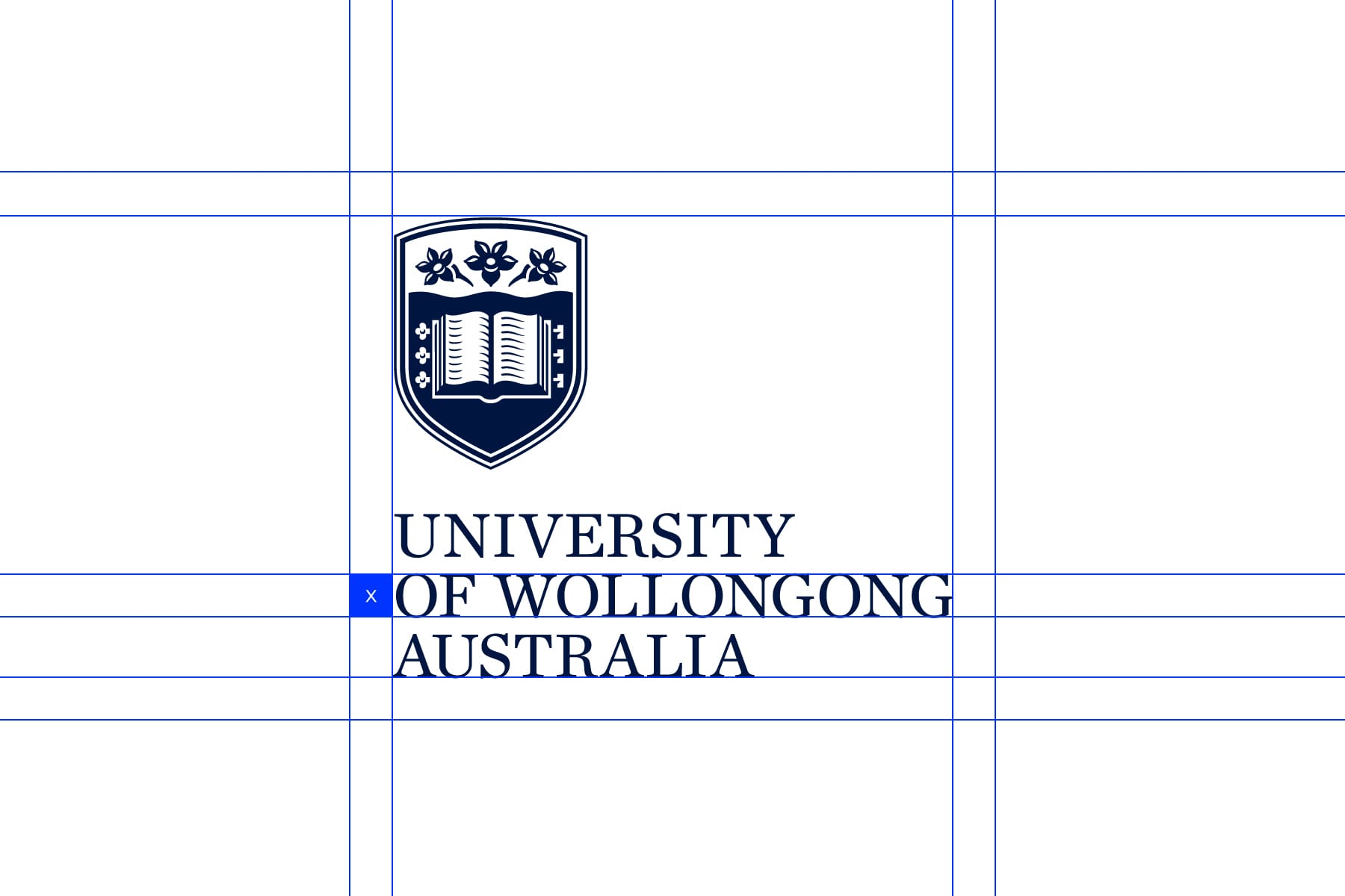
To ensure the integrity and visibility of the logo, keep clear of other design elements using these clear space guidelines. Use the height of the ‘O’ as a measure of adequate clear space.

logo-clearspace-1 logo-clearspace-2

Minimum size

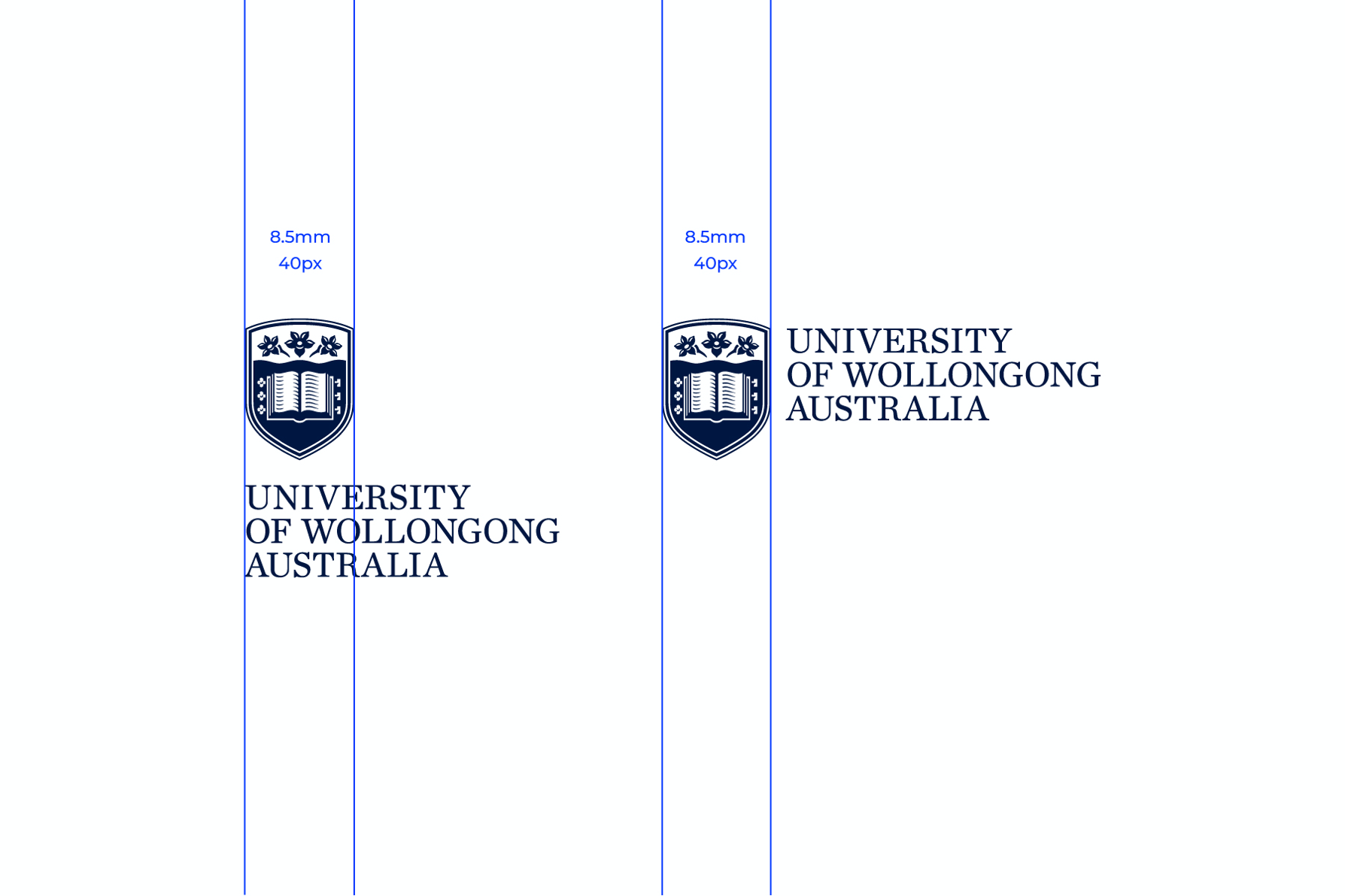
Minimum size is be defined by the width of the crest, no matter which version of the UOW logo you are using. For print, the minimum size is 8.5mm and for screen, it is 40px.
logo-minimum-size

Global and international campus logos

As we scale and localise UOW's brand around the globe, some applications require a global or localised logo variation. These logos can be requested via the resources page.

  • Global
  • Dubai
  • Hong Kong
  • Malaysia
  • India
logo-international-primary
Primary
logo-international-secondary
Secondary
logo-uowd-primary
Primary
logo-uowd-secondary
Secondary
logo-uowchk-stacked
Stacked
logo-uowchk-wide
Wide
logo-uowmkdu-stacked
Stacked
logo-uowmkdu-wide
Wide
logo-uowi-stacked
Stacked
logo-uowi-wide
Wide

Sub brands

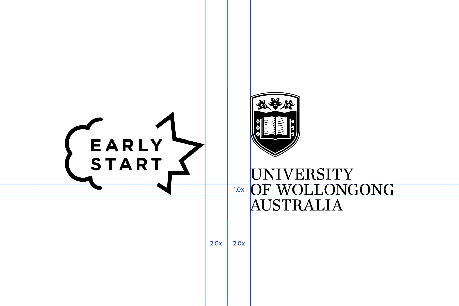
Sub brands are entities that exist within University of Wollongong. Sub brands are governed by the UOW Brand & Reputation Policy, of which the Advancement & Communications Division is the custodian. Shown below is how logo lock ups are constructed.

logo-sub-brands-1 logo-sub-brands-2

Partnerships

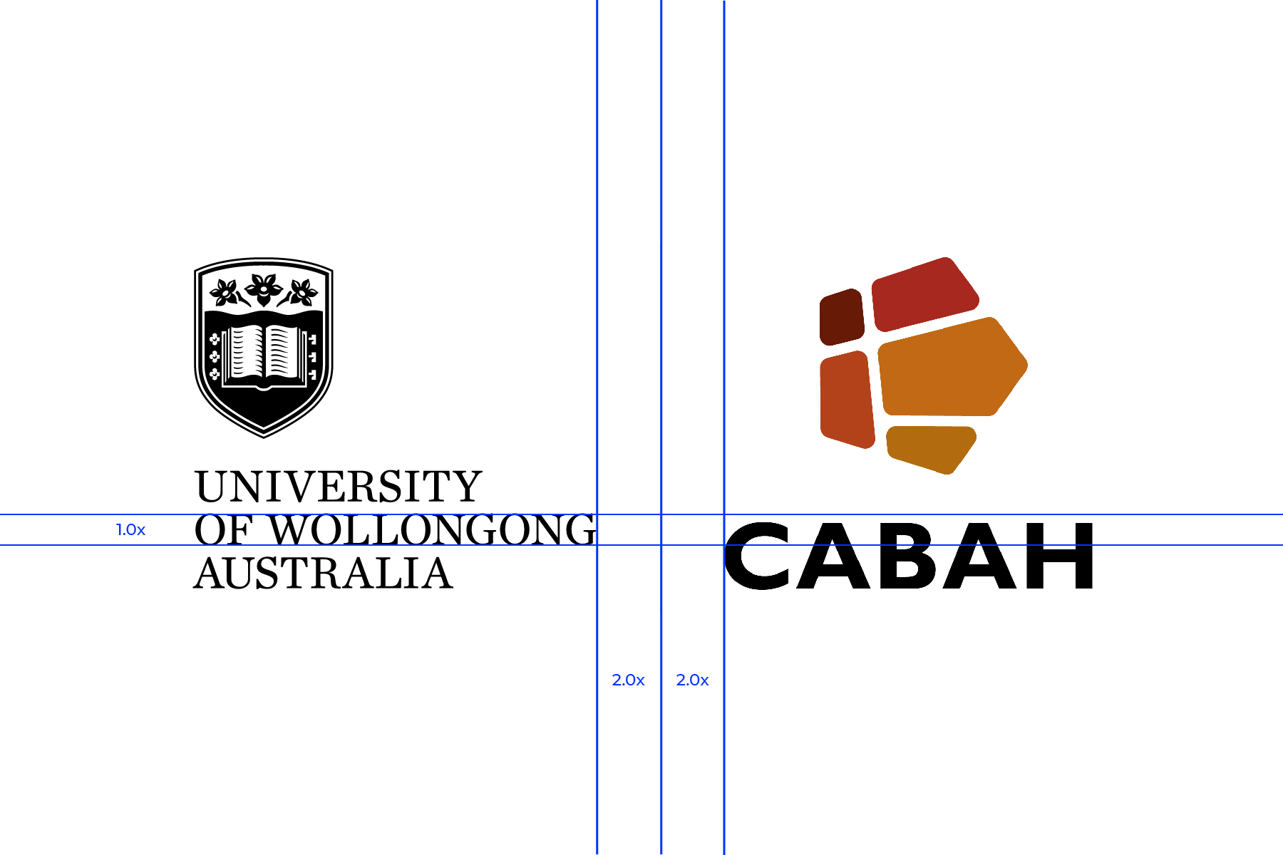
When the primary logo is used in partnership with other logos from other organisations, the primary logo should be placed on the left. The partner logo(s) should be scaled so they have equal visual weight.

logo-partnerships-1 logo-partnerships-2

Positioning

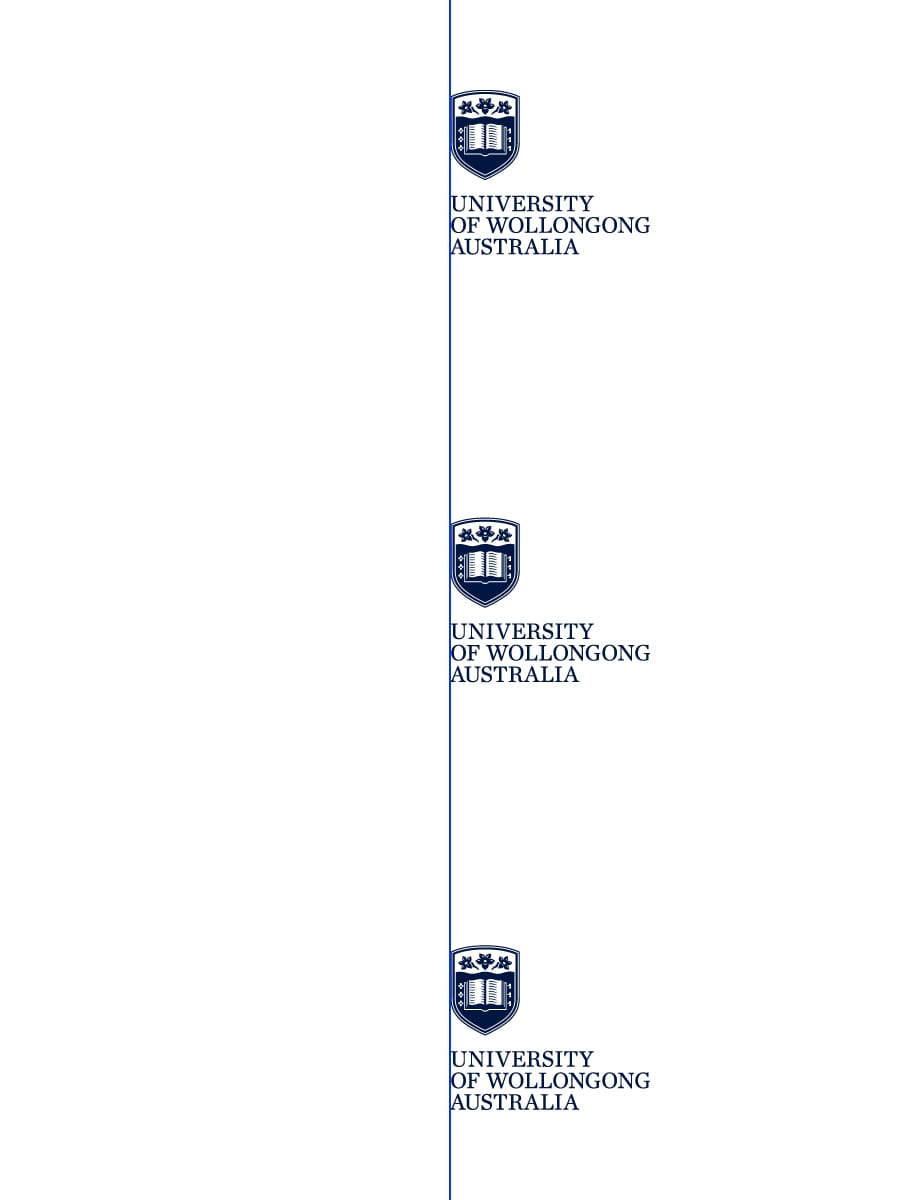
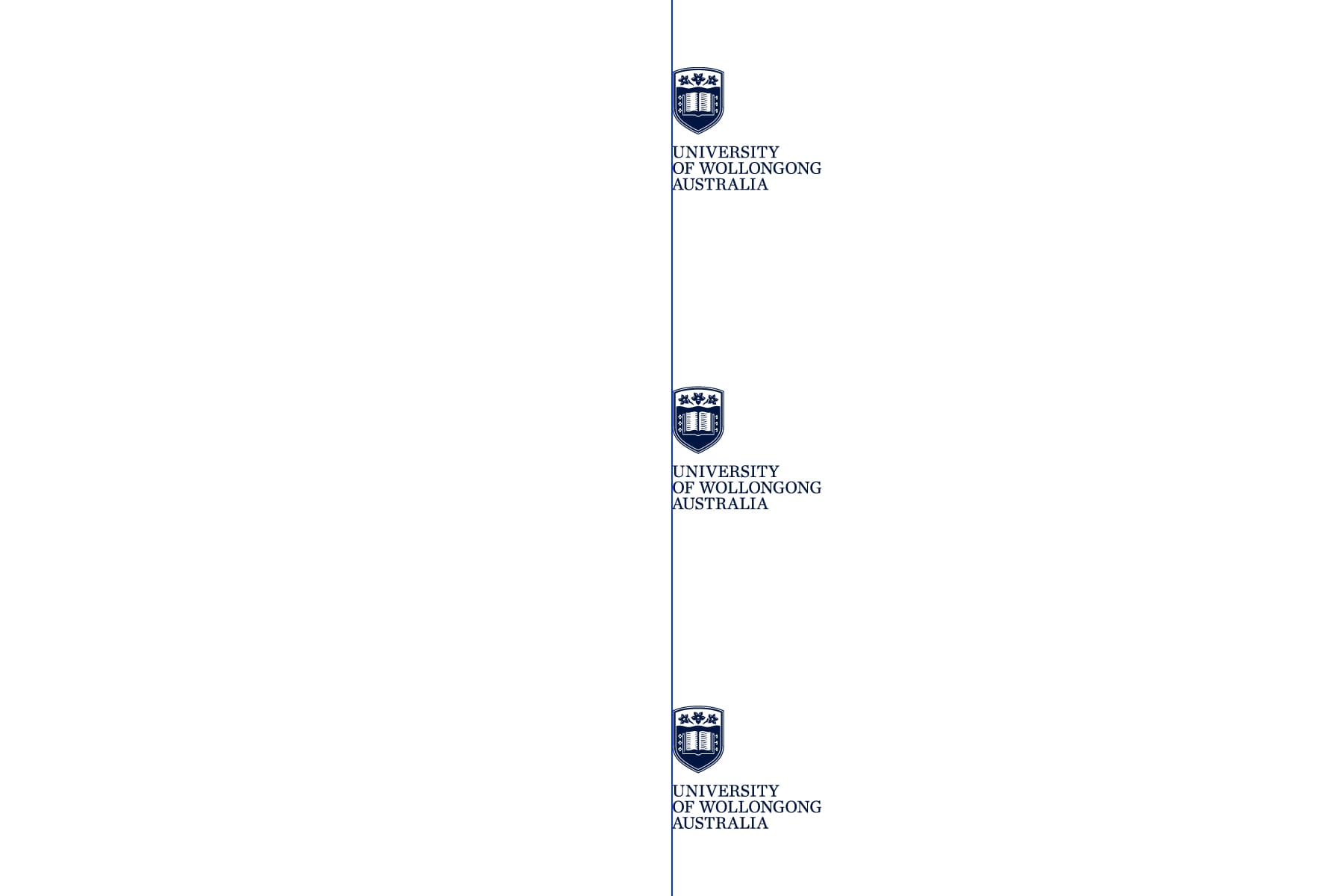
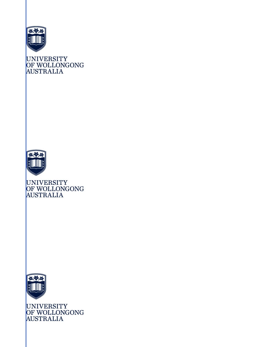
When using any version of the logo in applications, align it left, right or centre and place it either at the top, bottom or middle of the communication. Content should be aligned to the left axis of the logo.
  • Left-Aligned
  • Centre-Aligned
  • Right-Aligned
logo-positioning-port-1
Portrait
logo-positioning-land-1
Landscape
logo-positioning-port-2
Portrait
logo-positioning-land-2
Landscape
logo-positioning-port-3
Portrait
logo-positioning-land-3
Landscape

Guidance

To protect the integrity and strength of our most valuable brand asset, consistent use and application of the logo across all applications is of paramount importance. Consider the following points of guidance when applying the logo suite to any communication.

logo-guidance-1
Do not use drop shadow or any other effect
logo-guidance-2
Do not distort the logo
logo-guidance-3
Do not rotate any part of the logo
logo-guidance-4
Do not change the colour of the logo
logo-guidance-5
Do not change the transparency of the logo
logo-guidance-6
Do not reverse the positive UOW logo
logo-guidance-7
Do not compromise the legibility of the logo
logo-guidance-8
Do not alter the size or relationship of any part of the logo

In application

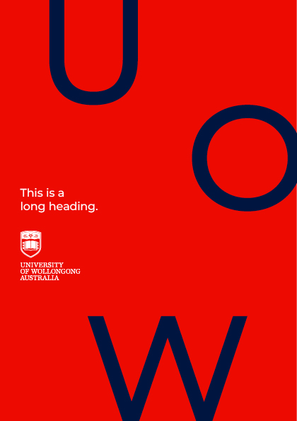
Covers

logo-in-application-4
logo-in-application-5

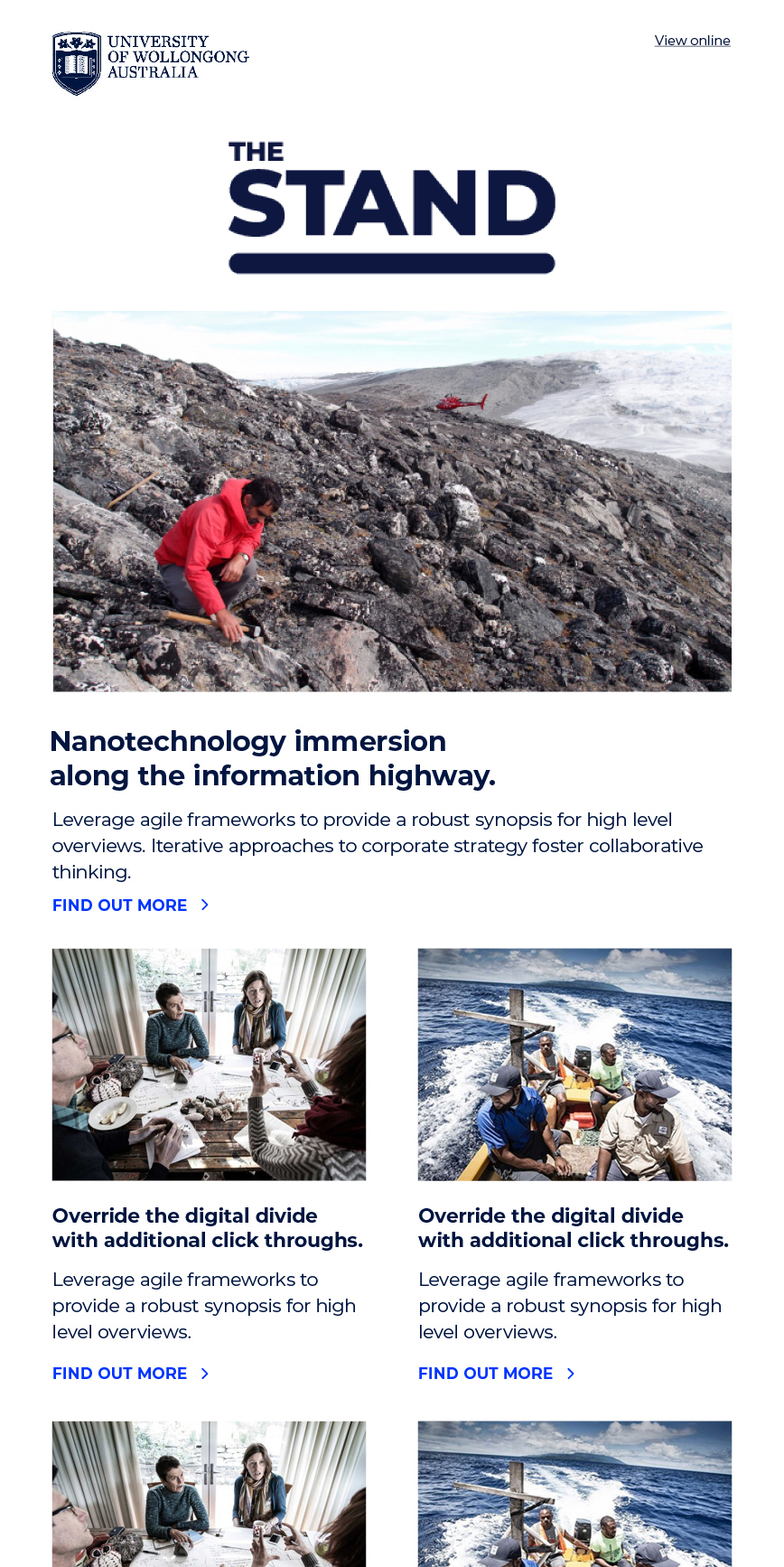
EDMS

logo-in-application-2
logo-in-application-1

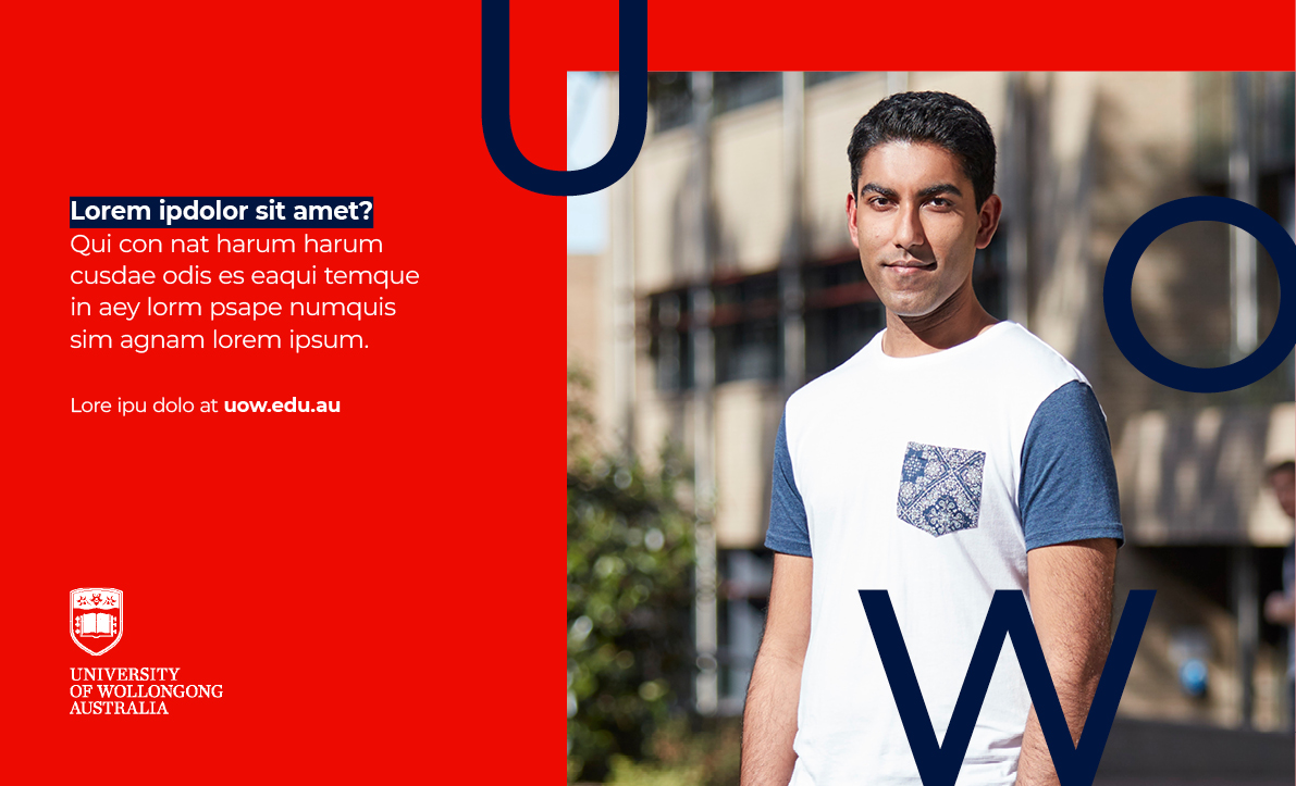
Billboard

logo-in-application-3
View more examples in brand experience

Logo summary

  1. Ensure the right logo is used for the right job.
  2. Consistency in application.
  3. Protect our most important brand asset.
Logo - University of Wollongong Logo - University of Wollongong

Find out more

About UOW Our Vision & Strategy UOW's Reputation Media Centre

Need help?

Call us on +61 2 4221 8700 or email brand-uow@uow.edu.au

Copyright © 2025 University of Wollongong. CRICOS Provider No: 00102E Privacy Disclaimer Site map